CSSで折った紙を開くアニメーションの作成方法
1. 概要
ウェブサイトをアニメーションやCSSスタイルで飾るのは大変だと思います。
今回は簡単にCSSで折った紙を開くアニメーションを作ってみます。
2. 考え方
1つのHTML要素だと折れないため、上のアニメーションを作成するのはHTML要素が4枚必要です。
例:以下のHTML要素は左上部分を表示します。半透明部分は隠します。
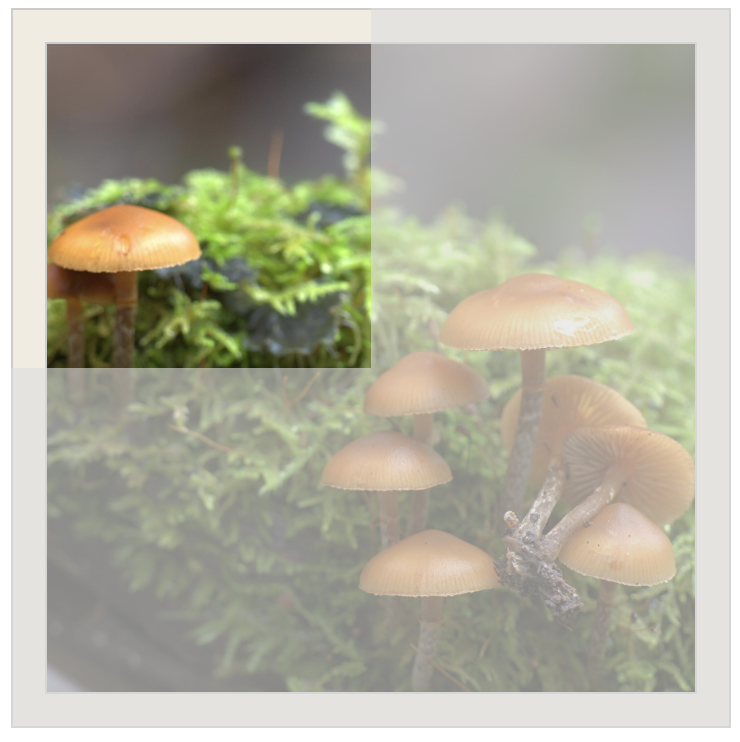
アニメーションの全体をコントロールするため4HTML要素を使います。
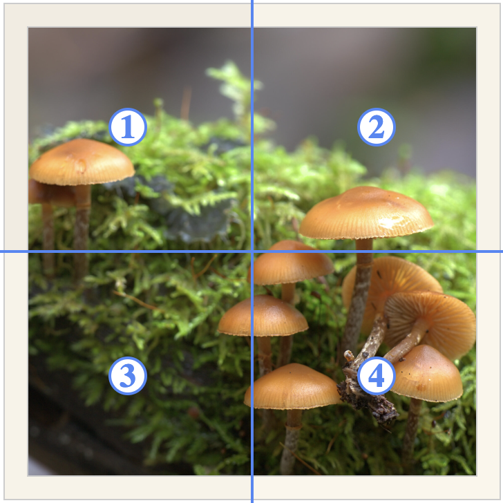
まず、要素3と4を非表示し、要素1と2の中身も非表示にします。
要素2を回して、左から右に開くアニメーションを作ります。
要素2が完全に開いたら以下のステップで進むように実装します。
- 要素1と2の中身を表示
- 要素3と4も表示
- 要素3と4を上から回転
以上でアニメーション終了です。
3. 実装
以下「index.html」ファイルを準備します。
<html>
  <head>
    <link rel="stylesheet" href="index.css">
  </head>
  <body>
    <div class="container">
      <div class="one">
        <div class="in_one">
          <img class="image" src="./mushroom.jpg"/>
        </div>
      </div>
      <div class="two">
        <div class="in_two">
          <img class="image" src="./mushroom.jpg"/>
        </div>
      </div>
      <div class="three">
        <div class="in_three">
          <img class="image" src="./mushroom.jpg"/>
        </div>
      </div>
      <div class="four">
        <div class="in_four">
          <img class="image" src="./mushroom.jpg"/>
        </div>
      </div>
    </div>
  </body>
</html>
同じフォルダーに以下「index.css」ファイルを置きます。
body {
display: flex;
justify-content: center;
align-items: center;
}
.container {
width: 360px;
height: 360px;
position: relative;
background-color: #DDD;
}
.one,
.two,
.three,
.four {
width: 100%;
height: 100%;
box-sizing: border-box;
position: absolute;
top: 0;
left: 0;
border: solid 1px #CCC;
}
.in_one,
.in_two,
.in_three,
.in_four {
width: calc(100% - 32px);
height: calc(100% - 32px);
box-sizing: border-box;
position: absolute;
top: 16px;
left: 16px;
border: solid 1px #CCC;
}
.one {
background-color: #f2ece1;
clip-path: polygon(0 0, 50% 0, 50% 50%, 0 50%);
}
.two {
background-color: #f8f3e8;
clip-path: polygon(50% 0, 100% 0, 100% 50%, 50% 50%);
}
.three {
background-color: #f8f3e8;
clip-path: polygon(0 50%, 50% 50%, 50% 100%, 0 100%);
}
.four {
background-color: #fbf6eb;
clip-path: polygon(50% 50%, 100% 50%, 100% 100%, 50% 100%);
}
.image {
width: 100%;
height: 100%;
object-fit: cover;
}
.two {
animation: fold2 4s linear 0s 1 normal forwards;
}
.in_two {
animation: in_fold2 4s linear 0s 1 normal forwards;
}
.three {
animation: fold3 4s linear 0s 1 normal forwards;
}
.in_three {
animation: in_fold3 4s linear 0s 1 normal forwards;
}
.four {
animation: fold4 4s linear 0s 1 normal forwards;
}
.in_four {
animation: in_fold4 4s linear 0s 1 normal forwards;
}
@keyframes fold2 {
0% {
transform: rotateY(180deg);
}
50% {
transform: rotateY(0deg);
}
100% {
transform: rotateY(0deg);
}
}
@keyframes in_fold2 {
0% {
opacity: 0;
display: none;
}
50% {
opacity: 1;
display: none;
}
50.01% {
opacity: 1;
display: block;
}
100% {
opacity: 1;
display: block;
}
}
@keyframes fold3 {
0% {
transform: rotateX(180deg);
}
50% {
transform: rotateX(180deg);
}
100% {
transform: rotateX(0deg);
}
}
@keyframes in_fold3 {
0% {
opacity: 0;
display: none;
}
75% {
opacity: 1;
display: none;
}
75.01% {
opacity: 1;
display: block;
}
100% {
opacity: 1;
display: block;
}
}
@keyframes fold4 {
0% {
transform: rotateX(180deg) rotateY(180deg);
}
50% {
transform: rotateX(180deg) rotateY(0deg);
}
100% {
transform: rotateX(0deg) rotateY(0deg);
}
}
@keyframes in_fold4 {
0% {
opacity: 0;
display: none;
}
75% {
opacity: 1;
display: none;
}
75.01% {
opacity: 1;
display: block;
}
100% {
opacity: 1;
display: block;
}
}
.label_text {
font-size: 32px;
font-weight: 600;
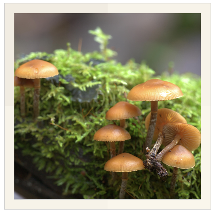
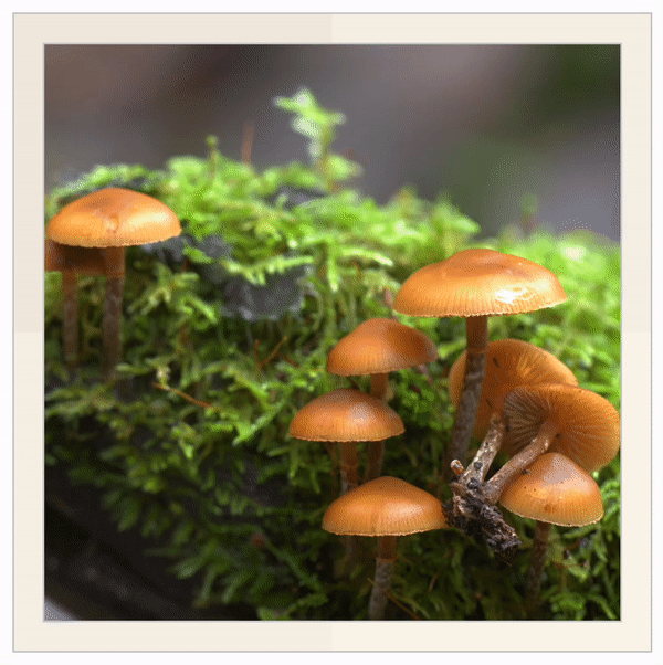
}最後に「mushroom.jpg」というファイルを同じ場所に置いてindex.htmlを開くと、以下ような動作をします。
4. カスタマイズ
画像だけではなく他の要素も使えます。
例:画像の代わりに文字列を表示したい場合、「index.html」の<img>タグを変える必要があります。
<div class="one">
        <div class="in_one">
          <label class="label_text">the fox jumped over the lazy dog</label>
        </div>
      </div>
      <div class="two">
        <div class="in_two">
          <label class="label_text">the fox jumped over the lazy dog</label>
        </div>
      </div>
      <div class="three">
        <div class="in_three">
          <label class="label_text">the fox jumped over the lazy dog</label>
        </div>
      </div>
      <div class="four">
        <div class="in_four">
          <label class="label_text">the fox jumped over the lazy dog</label>
        </div>
      </div>
保存し、「index.html」ファイルを実行すれば、以下の結果が出ます。
